Category Archives: Photography Experiment

JPEG and RAW

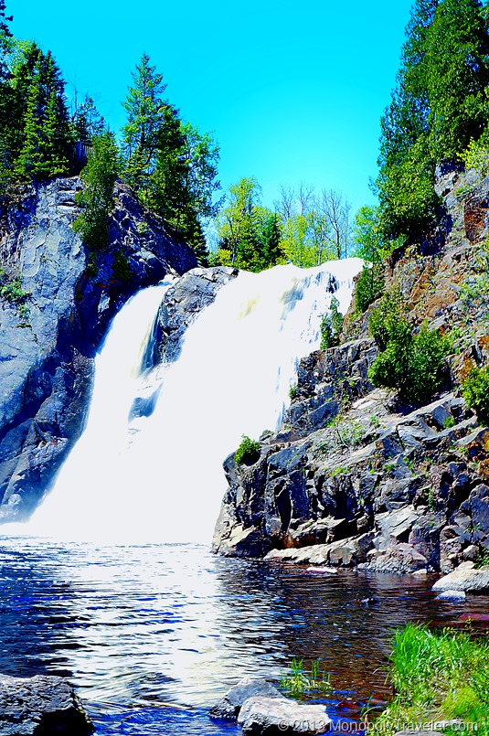
Unedited

Whenever possible I shoot in both RAW and JPEG. This has a couple of advantages for me. First, I can immediately view JPEG on a laptop or tablet to make sure the camera settings are what I’m looking for and to view the images I just took a little faster than bringing up the RAW images. I use the RAW images when I want to edit a photo. Is this necessary? That’s what I wanted to find out by taking a RAW image and a JPEG image of the same shot and see how much of a difference there was in editing it.

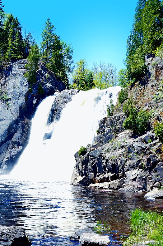
The photo above is the original picture as shot by the camera. It’s a little over exposed as I was using a slower shutter speed in an effort to get that silky motion in the water. That’s why this image was chosen. I wanted to see if the RAW image and all its information would provide a better picture after it was edited due to all that information. You can see the edited RAW image below.

RAW

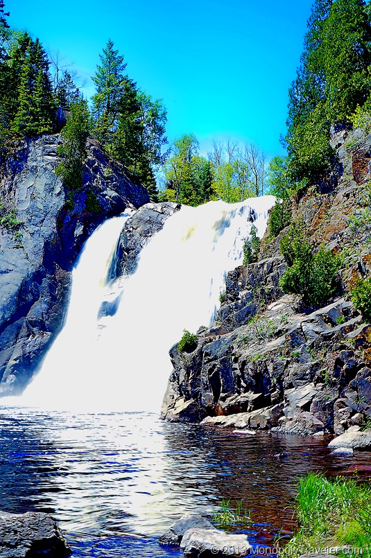
I’m certainly no expert at editing photographs but I am attempting to improve in an effort to bring out the beauty hidden in most pictures so that others can get an idea of what that photo was intended to show. After a few tweaks the photo above did not turn out all that bad. The water is still to bright but much of that information was clipped from the photograph making it impossible to retrieve.

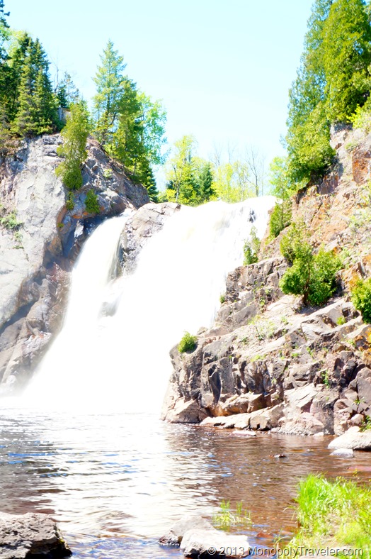
This next photograph is the JPEG version of this shot. I attempted to keep as many of the edits the same as possible between these two photos to see how they would turn out. As you can see, there is not much difference between them on this post. I will confess that the JPEG took more time to edit in an attempt to make both pictures look the same. The difference becomes more noticeable at 100% resolution.

JPEG

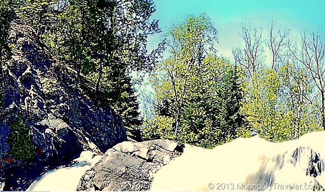
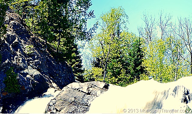
Here you can see a portion of the images at full resolution. Can you guess which one is the JPEG and which one is the RAW photograph?

100% size JPEG image

The JPEG version is above and the RAW version is below. At this magnification you can see the RAW version is a little more clean and crisp. Admittedly some of that has to due with the sharpening I applied to each one. The JPEG version likely has a little higher sharpening applied than the RAW version accounting for some of the difference.

My conclusion: JPEG is a perfectly acceptable format when using smaller size images. If I wanted to use a large print of this shot, I would definitely go with the RAW format after editing. To see Peter’s article which is the basis for this post in the photography experiment series, check it out here.

100% Size RAW image

Chasing Waterfalls


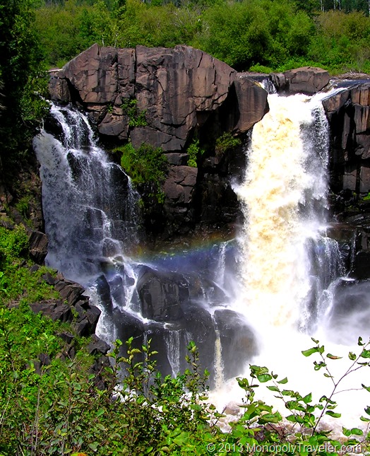
High Falls - Baptism River edited


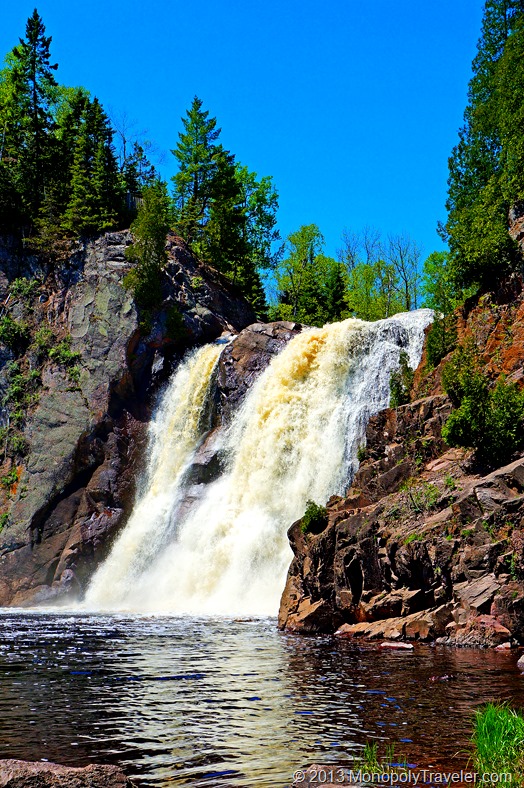
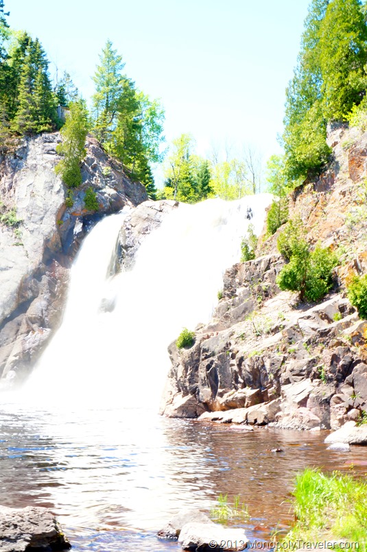
I did it. I went chasing waterfalls. And I did a fairly poor job of it in my opinion. One of Peter’s rules about waterfalls, which you can view here, is to avoid shooting in mid-day. I think every waterfall I photographed was mid day. Unfortunately there were time constraints and photographing waterfalls at another time wasn’t much of an option. This was an attempt to get the silky motion with shutter speeds of 1/10 second but it was just too bright out and I wasn’t able to change the aperture and ISO enough to prevent over exposure. Using editing software I was able to get most of the picture back from being over exposed but the waterfall is still to bright to really get the full effect of motion. You can see the picture before editing below.

High Falls - Baptism River unedited

When looking at the original, it is surprising how much you can do to improve the photograph.

This next picture was taken using the auto settings on the camera. Since it was so bright out the shutter was able to move fast and essentially stop the water motion. Fortunately there is enough water volume going over this fall that stopping motion works in this case.

High Falls with Motion Stopped

Here is perfect opportunity to try the silky motion by slowing down the shutter as the light likely would have allowed for it as well as the lower volume of water cascading over the falls. Unfortunately, this was taken before reading the ‘Shooting Waterfalls’ post by Mr. Carey with a point and shoot camera. Guess I’ll have to try it again another day.

Gooseberry Falls

This photo is of Pigeon Falls at the Minnesota – Canada border. Here is another case where silky motion would have been interesting. Although using a slower shutter speed may have altered the rainbow between the falls reducing its effect. Again this picture was taken before reading the waterfalls post and with a point and shoot camera. Hopefully I’ll have another opportunity to photograph these falls. Will the lighting bring the rainbows again next time?

Pigeon Falls

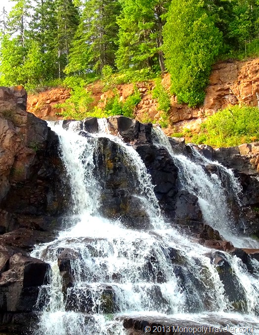
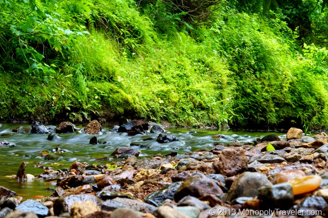
While enjoying a creek I decided to play with a slower shutter in an effort to get the silky motion and this was the best I did. There was no tripod so this was 1/10 second shutter speed while hand holding the camera. In fact none of these waterfall pictures were taken using a tripod. Not bad for holding the camera if you ask me. Taking more time I would set the camera where it would be still and take a longer exposure photo to get even more silky motion.

Definitely room for improvement in shooting waterfalls. I will most likely get the opportunity while visiting Alaska later this summer. I suppose getting out for more practice might be a good idea before then.

Silky Motion Rapids

Rule of Thirds

Thirds

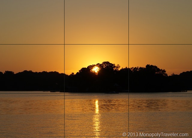
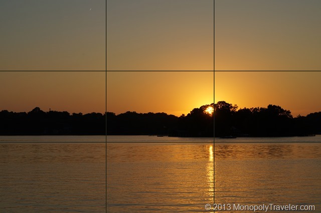
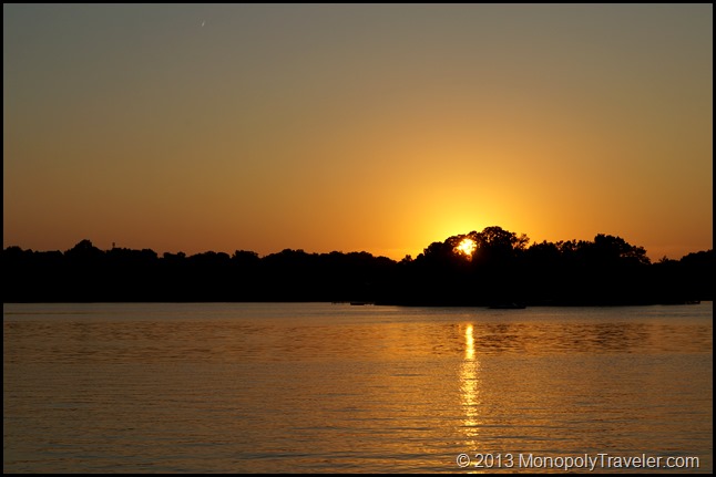
One of the rules of photography is to place focal points or points of interest into a third of the shot. That is a point where the lines intersect on this grid.  For a little more in depth description check this out. The grid above represents a photo divided into sections equaling a third. Many cameras have this grid available for display and I have added this into my display. I enjoy photographing the setting sun (and rising sun if I’m out and about with the camera) so this seemed like a good subject for the thirds experiment. The picture below has the sun centered in the photograph as you can see by the grids. Hmm….interesting.

Setting Sun Centered

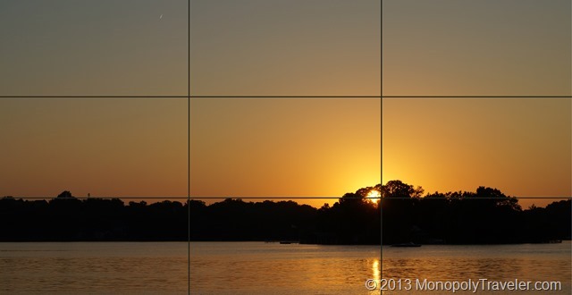
I really don’t think it is all that bad but then again the subject – setting sun over a lake looks good in just about any picture. Now let’s see what this looks like using the thirds rule. After adding the grids you can see that the sun is in the lower, right third of the picture. I definitely like having more of the colorful sky in the picture but in this case the water could really be shown more, especially with the suns reflection. As is stated in Peter’s post, “The Rule Of Thirds is a handy place to start when trying to figure out how to frame a scene. It’s also a great jumping off place for further experimentation.”

Setting Sun on Grid

I do think the sun and it’s reflection in the water look better off to one side or the other so let’s keep that part of the photograph at the thirds line. Adding a little more water to the picture and just a little bit less sky gives me a picture that shows the highlights of what I was enjoying that night – water with the suns reflection in the waves, setting sun with so many beautiful colors, and the silhouettes of the surrounding shore contrasting with the sky and water. Yah, keeping the sun to one third of the picture is better than centering it in my opinion.

Adjusting the Rule of Thirds

For those who would like to see this picture without the grids on it, here it is.

DSC04329

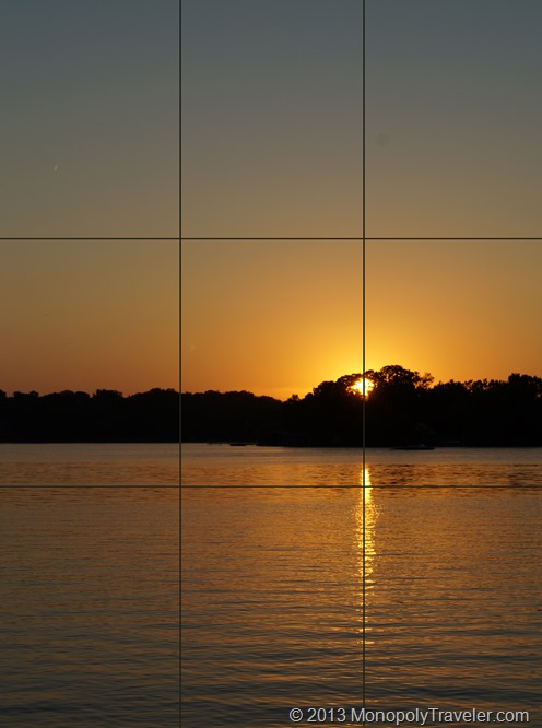
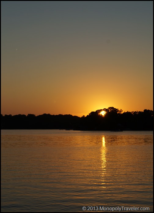
Since I really liked the sun reflecting in the water and the transitioning colors of the sky, changing the orientation of the camera offered the opportunity to capture more of both. I still kept the sun on the right third of the picture as you can see by the grid lines. That did it! this shows all of the sun’s reflection in the water and the colors of the sky transitioning from the reds and yellows to the darker blues of the oncoming night sky.

Verticle with Grids

Once again a chance to look at this picture without the grids. If trying to decide which one of these to frame, I’m not sure which one I would choose. Which one would you choose? Why? It would probably depend on where I would hang it or what I was going to do with it.

DSC04330

Histograms

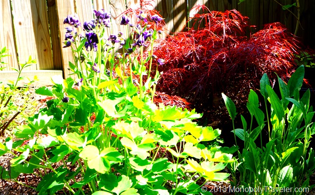
Without Looking at the Histogram

As I continue to practice with cameras and improve the photos I take, I added the histogram to the rear display to see how the exposure changes with different shots. You may first want to read Peter Carey’s article describing histograms before continuing on with my attempts with it. The photo above was the first picture taken before putting the histogram on the camera display. This was taken using the camera auto settings.

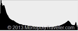
3093 hist

This is the histogram of that photo. The high peak on the left indicates the darks/shadows are being clipped. Ideally the histogram would have the peak towards the center meaning that the sensor was getting as much information as possible. This is a bit of a challenging situation because part of the subject is in the sun while other parts are in the shade which you can see with the over exposed leaves and some dark areas in between the plants. in an effort to maximize the information the sensor is picking up I pointed the camera at the same plants but from different directions as well as changing some of the camera settings.

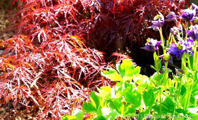
Adjusting to Optimize the Histogram

Focusing on areas of the plants that are in the sun eliminated the darks/shadows clipping as you can see in the histogram below. There aren’t as many over exposed areas in this photo as in the picture above. Both of these photos are using jpegs as taken by the camera. Because they are jpegs the advantage of the histogram still is not as visible.

3102 hist


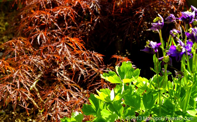
To get the most out of the information that the camera sensor picks up a RAW image is useful. RAW images store more data maintaining more of the properties of that picture which becomes important when using photo editing software. The photo below is the exact same picture as above but started in the RAW format and processed with an editor. Because I paid attention to the histogram, the camera sensor was able to get more information almost eliminating the over exposed leaves as well as getting a truer color. Also, the shadows provide a little better sense of depth because they where not clipped when taking the picture.

Another little detail that can really help get better pictures in the right situations.

RAW image corrected with histogram

31+ Days to Better Photography

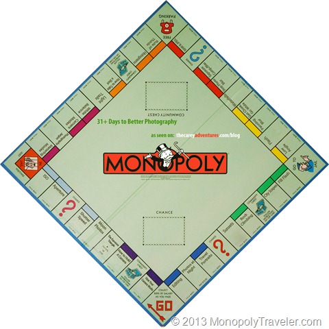
Monopoly-Board-31-Days

For 2013 one of my goals is to complete this Monopoly© 2012 Hasbro board to better photography. This idea came from the posts on the Carey Adventures website on ways to improve your photography. Each location on this board refers to one of Peter Carey’s posts. My goal is to take at least 100 photos for each topic and identify what I’ve learned and how it improves my photography. The cost is mostly just time and the results are almost instantaneous to do this as we don’t have to develop film any longer. In some cases I expect that 100 photos will not be enough and in others it may be a challenge to take that many pictures on the journey to completing this board.

I’m not trying nor do I expect to become a professional photographer by completing this. My goal is only to improve the shots I take so I can share them here for others to enjoy and share in the experiences of traveling to different national parks. Thanks to Peter for sharing these tips with others. In this day and age as taking pictures gets more and more affordable and easier to do, the quality can be so much better than even a decade ago. Unfortunately not all of the topics on this board have been written about on Peter’s website. If those topics are not added to during 2013 I will have to either research these topics from other places or choose different topics to work on. During 2012 I have played with some of these settings but look forward to taking more time to experiment and learn in greater detail in 2013.

To check on my progress throughout the year click here to go to the Photography Experiment page.